Friday 30 September 2016

Adobe Animate - 2D Motion Exercise


Today's animation session focused on the distinction between timing and spacing necessary to create realistic motion.
In order to develop an understanding I produced two separate experiments.
The first is simple linear motion of a ball. The uppermost ball moves at a constant rate, whereas the second accelerates and and decelerates. More tightly spaced frames produced an illusion of slowing, whereas spaced out frames created a sense of speed. Acceleration/deceleration was achieved by staggering the increase/decrease in the spacing of each frame.

The second experiment was with motion along a curve or about a pivot, using pendulums. The first - stuck to a horizon line, was to illustrate incorrect movement when a curve was expected, one shows curved motion at a constant speed, and one shows a more natural motion, accelerating and decelerating at it's trough and peaks.
Zooming Balls (50 FPS)
My array of pendulums (50 FPS)
25 FPS
25 FPS

Character Creation - Adobe Illustrator Tut. Part 2

This is the final version of my Beatnik Blob as follow up to the Adobe Illustrator tutorial last week. I haven't attempted anything like this before, so I'm quite pleased with the result, and I think it's a really successful design.

Final coloured version. Three layers of colour - matte colour, shading, and highlights.

This is the version I accidentally uploaded without any infill on the eyes, just the alpha channel. I'm leaving it as I actually quite like the more disturbing turn it took aesthetically as a result. Not quite child-friendly enough for what's meant to be a Pixar inspired character though.

Adobe Animate - 2D Animation Morphing Exercise


Thursday 29 September 2016

Online Maya Tut. Introduction to Autodesk Maya: Block Modeling

This is my version of the retro ray gun from the second online tutorial, made using the block modeling method whereby polygon primitives are essentially shoved inside each other to create an overall form. The final render was achieved by applying a three-tone toon style shader to every individual object that the overall volume is comprised of, and an intersecting outline effect.

Anyone that hasn't looked at this yet, I'd strongly recommend watching the video through, and then modeling it from memory as best you can, just referring back to the video for little bits you absolutely can't remember. If you keep pausing the video to do it step by tiny step it will, the exercise will drag out and you'll likely miss important details in the video.

Once you've survived the ordeal of the video (1 hour 10 minutes), making the gun is actually good fun.
"Pew pew"

Second Life Drawing Session

15 Minute drawing (graphite)
5 Minute drawings 1 & 2 (Continuous Line - charcoal)
5 Minute drawing 3 & 4 (graphite)
2 Minute drawings - experimentation to rapidly capture pose (fineliner)
30 Minute face study (low light, graphite)

Wednesday 28 September 2016

City Thumbnails 1-12

These are my initial thumbnails from last week. The thumbnails I'm working on now will be quite distinctly different from these as I'm ensuring they are all informed by visual research as per Jordan's recommendation, which I'll be posting later today and over the next few days

These first 12 were drawn purely off the top of my head as an experiment, but I definitely need references to get the results I want. I also spent altogether too long wrestling with Photoshop brushes - I'm having difficulty getting any degree of sharpness without the thumbnails turning into line drawings, but I'm determined to do at least the majority in Photoshop in order to improve prior to having to tackle the final paintings. If anyone has any specific brushes or settings they can recommend, I am all ears.


I wrote a short description of how I imagined Anastasia before I started thumbnailing in order to get a clear idea of what I was after. The thumbnails don't necessarily live up to the same level of detail, but this is their basis.

Anastasia is an opulent merchant city, seemingly formed about a lavish upper class who drive the demand for jewelry, cuisine, finery etc. This in turn attracts craftsman and trade, arriving via the waterways which have sprung up as infrastructure necessary to import raw materials, and ease the pressure on the congested narrow streets. Anastasia can make you a rich man, but only by the standards of other Cities – no matter how great a craftsman or merchant you may be, you will never possess wealth enough to join the city’s upper echelon.

The streets are littered with merchants plying their wares from stalls and open tents, labourers sorting incoming shipments at the myriad of docks, with jewelers, blacksmiths, weavers and tailors all setting up shop in the immediate vicinity – being too far from a dock will mean you lose out on incoming shipments, so difficult is it to move cargo through the throng of people cascading through the city. So busy is the ground level of the city that by necessity a melange of kites rises above the crowds, riding the ever present breeze, marking out streets, City Authorities, districts, some serving as signs for shops and taverns, else due to the city’s concentric, repeating design, you would be lost in a matter of moments.

Every building is organised thusly – what would be the first two floors are extensions of the streets, high arched tunnels and niches cut into each building’s foundations. These halls ring with activity, clangs, clatters and shouts echoing off the domed ceilings, for this is where the common folk set up their workplaces and homes, some little more than hovels. It is here that all of wonders of Anastasia are produced. Where the majority of these goods can be found, however, is up above, where any ordinary building’s 3rd floor would be, but in Anastasia this is where the truly liveable space actually starts. Lavish mansions and above ground gardens sit atop the common sprawl, occupied solely by fabulously wealthy Anastasians, who act as though the people below were no more than rats scurrying about the house’s foundations. No true Anastasian ever alights to ground level – their every need provided for by servants who roam the ground city on their masters behalves. The sole exception is when they leave their abodes via their private docks, in order to visit other upper class residences or buildings.

Many of course resent the exorbitant wealth of the ruling class of Anastasians, often resulting in theft, but every would-be criminal is without fail stymied by the densely packed crowds blocking their escape and can only watch helplessly as above the crowd, the blue kites of the City Guard slowly bob towards them. 

Tuesday 27 September 2016

Perspective Drawing Exercise

One point perspective
Two Point Perspective
Three Point Perspective


Online Maya Tut. Introduction to Autodesk Maya: Modeling in 3D Software

This is a follow up exercise building on the Maya intro in Monday's session with Simon. Following the first of the online CG Artists Toolkit Lectures, I created 4 different versions of an egg cup I modeled to illustrate the differences between models using NURBS surfaces, low res polygons, SubD surfaces, and subdivided polygons.
From left to right: NURBS Surfaces, Low Res Polys, SubD Surfaces, Subdivided Polys
Alternate Angle
Wire-frame overlay illustrating the key differences in construction of each model

Intro to Maya - NURBS and Polygon Modeling

First Maya tutorial. Although I've previously used Blender for modelling, Blender works very differently to Maya, so essentially I'm learning from scratch anyway.

We were initially introduced to NURBS, and how to use curves to generate NURBS surfaces (in order to form volumes). It's a modelling method I haven't encountered before, which worked really well for rapidly forming organic shapes. I used the method to great a variety of Chalices/Fluted Glasses and a tureen, so which I angled as if they were in the process of being knocked over.

In order to get to grips with poly modelling I modeled a goblet, starting from a cylinder mesh as a base, inserting and manipulating edge loops to push and pull the mesh into the rough form of the goblet, which was then smoothed out by converting it to SubD surfaces.
NURBS Surfaces Crockery
Wireframe Overlay showing the Isoparms
Poly modeled goblet, smoothed out by SubD surface mode
Wireframe Overlay showing the smoothed out poly mesh


Monday 26 September 2016

Character Creation - Adobe Illustrator Tut.

So I got to take my first stab at creating a character concept in Simon's Adobe Illustrator Tutorial on Friday. It had to be Monsters Inc esque and be a kind of beatnik (I learnt a new word!), artisty kind of character. Basically a pretentious douche kind of a character.

I think my design went a tad darker than what Pixar might have had in mind, but I like it. Well... As much as anyone can like a crazed blob wearing a beret and licking its own eyeball.
The initial drawn design, fleshed out from some quick thumbnails. It has 3 tentacles, 3 eyes, and 2 claw-arms to scrape itself along the floor at high speed so that it can continue screech poetry and marxist propaganda at you as you run.
This is the shiny refined version made by tracing over a scan of the original concept in Adobe Illustrator. I spent quite a frustrating while getting used to how the progam generates curves, but once I got my head around it I got a much cleaner result and the image has a lot more character from having played with the line weighting/widths.

Thursday 22 September 2016

First Life Drawing Session

The first life drawing session was brilliant. I have little confidence in my drawing at this stage and can have trouble starting. The session forced me to just do it, put out whatever I was seeing as roughly as I wanted, and I surprised myself with some of the results.

I photographed my work and it is displayed in order in the Scribd document below. 

The first exercise I was quite light handed, so I have multiple closer up photos of the one drawing because the detail wasn't being picked up well by my phone's camera.

I'm most pleased with the sheet of multiple 5 min continuous line drawings. Some of the proportions are off, I wasn't able to capture all of the model's form each time, but in spite of that each drawing was better than the last, and I feel like I started to capture some of the crucial detail that really conveys a sense of his pose and almost motion, and as a result didn't need the whole form or fine details. I was able to achieve much more in the time than I expected.

Digital Painting Induction Part 2 - Colour Apples

This is the colour follow up to the greyscale digital painting exercise. I chose the same image of the apples to work from in order to improve upon the issues in the first exercise, and I feel as though it made a quantum leap forwards. 

I'm much happier with the form of the apples, the composition, the contrasting tones - essentially every aspect has improved. Again I worked from right to left, apple by apple, and again I think my technique has improved each time, although the third and largest apple is maybe a tad glossier than I wanted - the initial two apples seem to have more of a sense of realism to them.

Much as I like using the clipping mask, I could potentially do with taking greater care with the silhouettes I create as a base. They are far more accurate than in my greyscale attempt, but some of the roundness of the apples has been lost due to a lack of attention to the smoothness of the silhouette's outlines. I could of course have smoothed it out with other tools/methods, but I wanted to leave it unmodified as a record of an aspect I can improve on.

They're quite definitely apples this time. No more amorphous grey blobs.

Digital Painting Induction Part 1 - Greyscale Apples

This the result of my initial foray into digital painting from Monday's Photoshop session. 

I haven't painting digitally before (as may be obvious) and I'm pleased with this initial outcome as my technique improved with each successive apple. I painted each apple separately starting from the right, experimenting with different brushes until I started to get effects I liked. I relied heavily on clipping masks - starting with a block silhouette which then locked down the workable area in the next layer - to allow me to focus on tone without worrying about ruining my overall forms, which I found to be a great perk of working digitally vs analogue.

I can see clear issues with form and contrast which I have improved upon (and will continue to) in follow up digital painting practices.

Still life Apples! And one lumpy Death Star...

Tuesday 20 September 2016

Film Review - Das Cabinet des Dr. Caligari, Robert Wiene (1920)

Robert Wiene's Das Cabinet des Dr. Caligari (1920) has aged incredibly well. In spite of being a silent film, even millennials will struggle not to draw clear parallels between Caligari and contemporary cinema. The character design of Tim Burton's iconic Edward Scissorshands (1990), as portrayed by Johnny Depp, reeks of Caligari's Cesare, both aesthetically and in his withdrawn awkwardness, not to mention the striking resemblance of the building design in his Corpse Bride (2005) to the crazed angularity of the town of Holstenwall. Calagari's narrative can be seen to have a direct influence on films as recent as Martin Scorsese's Shutter Island (2010), which further explored the theme of the externalisation of the internal constructs of a madman and leant heavily on a nearly identical twist ending, and it can even be argued that it (Caligari) provides an antithetical basis for films like Miloš Forman's One Flew Over the Cuckoo's Nest (1975), which examines the impact of a sane man having madness projected onto him, versus the insane projecting their reality onto a sane world. Caligari's influence is pervasive to this day.

More striking though than its enduring impact, is how effectively even a contemporary audience, spoilt by decades of films replete with spoken dialogue and vast repetoires of SFX, can engage with and digest its relatively complex, yet soundless narrative. There are three key visual and narrative elements that enable it to succeed even 96 years later.

Firstly, the unwaveringly persistent visual aesthetic. Wiene does not so much employ the more subtle mise-en-scène audiences have now grown accustomed to, as punch viewers in the face with geometric unrealism. Nearly all of Caligari's buildings, structures, and even objects of furniture are inescapably presented as illogically angular forms, oppresively looming over each scene and its characters, cutting off the skyline, and creating a vague sense of claustrophobia. The iconic scene in which the Somnambulist, Cesare, doggedly sets off along the zig-zag of Holstenwall's skyline, heroine tucked under his arm (see fig.1.), inspires a sense of the sinister, not just due to the inherent nastiness of kidnapping, nor Cesare's discomfortingly slender figure, but because the environment itself narrows and jerks in an illogical, visually jarring manner. Intriguely however, ignoring the prologue, the film initially maintains an almost light-hearted tone in spite of the negative connotations of the off-kilter mise-en-scène. That is because this is not Disney. A shape language has been established in film in the past century which tells us that sharp, angular imagery is inherently of the sinister, the evil, the aggressive, but one could argue that Caligari predates this rigid language, which in turn allows it to defy the jaded expectations of the contemporary audience. This contradiction of expectation leads into Caligari's second key element.

https://blogger.googleusercontent.com/img/b/R29vZ2xl/AVvXsEg-yIatCYIB-L3VSQuQitZoMNzhWJhmSSd9LY6BdFhU6HCnbIXbVFwcgJdxRJdqxcqeBf_O12Nb8Y804uioHt1RYfKv5pAVd77bRi2uW_hE7O5A4cGNGeIzm5VXrxpHYgPP9oRa7dMi1tQp/s1600/dr.-caligari-1.jpg
Figure.1 Cesare escaping across the rooftops of Holstenwall as he kidnaps the heroine, Jane (1920)
The geometric awkwardness of Caligari may loan itself to inspiring angst in its audience, but this is not by design. Its actual purpose is arguably that of transition; the distorted forms, representative of the broken psyche of the film's hero, provide the audience with visual anchors to the real world, and the world of the hero's internal narrative, allowing a clear distinction between those scenes set in reality, which feature curves and perpendicular lines, and those set in the protagonist Francis' mind. An ideal comparison would be to Joseph Kosinski's Tron: Legacy (2010). Divisive as stereoscopic 3D in cinema may be, it was used beautifully in Tron: Legacy to differentiate between the setting of the real world and the digital - its opening and end scenes are shot in 2D, whereas all the scenes set in Tron's digital world of 'The Grid' are shot in stereoscopic 3D. So subtle is this transition that many audiences would have failed to notice, but this particular transition literally added an extra dimension to the world of 'The Grid', ironically making it more 'real' than the real world setting of the film's 2D scenes. Caligari achieved this 90 years prior merely by distorting our expectations of recognisable shapes - the audience inevitably becomes more engaged in the world which challenges their established schemas of a sane world.

This theory is further supported by a direct comparison of the appearance of Dr. Caligari himself (later revealed to be the director of the insane asylum in which Francis is revealed to be interned). In Francis' mind Dr. Caligari is exaggerated, his face shadowed and obscured by a needlessly thick glasses frame, dark bags beneath his eyes, his movements furtive and defensive (see fig.2.). These are the primary elements of what visually makes him an insidious, untrustworthy character. In reality Dr. Caligari is revealed to be a well-kempt, unassuming man with a professional air - entirely unthreatening, cleansed of his negative attributes. The distorted geometric theme of Francis' mind is not used to contribute to Dr. Caligari's perceived vileness at any point.

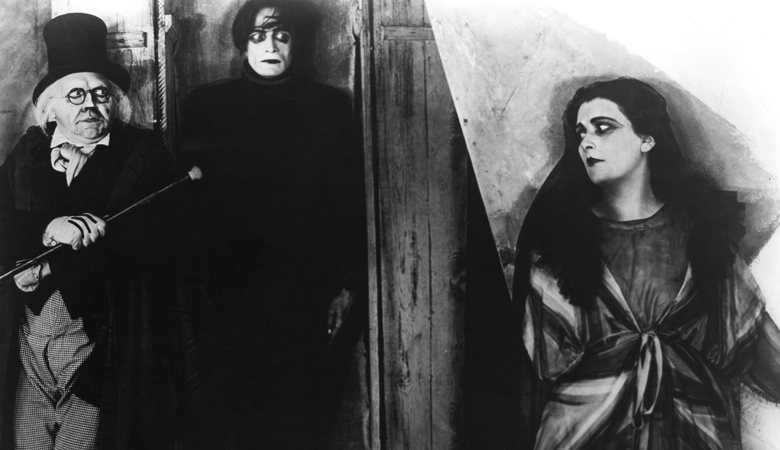
Figure 2. Jane, lured by Dr. Caligari, encounters Cesare the Somnambulist (1920)
The third and final element is the narrative twist. Even now, an effective twist is rare in films. It requires an impeccable set-up that refuses to clue in the audience until the last possible moment. Caligari achieves this with it's unassuming opening scene, in which Francis, seated on a bench outdoors, watches a woman walk past, of whom he states to the man seated next to him is "My betrothed..." He pauses "What she and I have experienced is yet more remarkable than the story you have told me. I will tell you..." (Das Cabinet des Dr. Caligari, 1920)

A moment beforehand, the man whom Francis is addressing had explained that he had been driven from his home and family by spirits. This is a more than acceptable statement since it is of course a film. The audience has suspended its disbelief and is perfectly willing to accept that spirits are real. But, at the end of the film, this tale of tragedy, murder, and duplicity in which the audience has invested real emotion in our hero, and developed a healthy hatred of the antagonists, we snap back to the real world and it is revealed that Francis, and not Dr. Caligari, is the mental patient.
Image result for caligari opening scene
Figure 3. Opening scene (1920)
In a glorious instant, the viewer is catapulted in reverse back through their narrative journey. The opening scene; the man on the bench, assaulted by spirits, is not a poor misbegotten soul - he is a lunatic, accompanied by Francis - chief lunatic incarnate, observing a third lunatic wander past (see fig.3.). Their sufferings are designs of their own fractured psyches. Francis has not been revealing his past, but weaving his personal fantasy, projecting his psychosis onto prevalent figures in his real life, his betrothed - the attractive female inmate Jane, the Somnambulist - yet another inmate, the notorious Dr. Caligari - the director of the asylum, the man responsible for Francis' treatment. It is notable that with regard to the antagonists, in reality Cesare is a younger, more attractive man, from Francis' perspective perhaps a potential love rival, and Dr. Caligari, the authoritarian figure within the asylum and therefore Cesare's master, the reason for Cesare's threatening presence, and a force actively working against Francis - hence the 'theft' of Jane, by Cesare upon being ordered to by Dr. Caligari. The narrative hasn't been pure fantasy; Francis has been projecting legitimate fears and concerns onto the people he perceives as their direct cause, the murders which occur early in the narrative are perhaps a representation of other asylum inmates placed in solitary confinement at the behest of Dr. Caligari.

A contemporary audience will struggle to bear the slower pacing of this aging film, but even now, the film sustains its audience by the hook and underlying purpose of its unique aesthetic. It pushes their expectations off-centre and holds them captive, denying the audience the visual conformity their brains are vying to find. And although audiences are spoilt wannabe films critics, the pacing is immediately forgiven for that instant of realisation in which the entire narrative is reinvented in the blink of an eye - as though it has been averaged out. The cathartic shock of the epiphany provided by the narrative twist is no less potent in this older medium than in recent films such as Christopher Nolan's Inception (2010) and The Prestige (2006), or M. Night Shyamalan's Unbreakable (2000). Until contemporary culture has worn these devices so thin as to be unbearably predictable, Robert Wiene's Das Cabinet des Dr. Caligari will continue to endure and surprise.

Bibliography
Das Cabinet des Dr. Caligari (1920) Directed by Robert Wiene
Edward Scissorhands (1990) Directed by Tim Burton
Corpse Bride (2005) Directed by Tim Burton and Mike Johnson
Shutter Island (2010) Directed by Martin Scorsese
One Flew Over the Cuckoo's Nest (1975) Directed by Miloš Forman
Tron: Legacy (2010) Directed by Joseph Kosinski
Inception (2010) Directed by Christopher Nolan
The Prestige (2006) Directed by Christopher Nolan
Unbreakable (2000) Directed by M. Night Shyamalan

List of Illustrations
Figure.1 Cesare escaping across the rooftops of Holstenwall as he kidnaps the heroine, Jane (1920) [Film Still] At: https://blogger.googleusercontent.com/img/b/R29vZ2xl/AVvXsEg-yIatCYIB-L3VSQuQitZoMNzhWJhmSSd9LY6BdFhU6HCnbIXbVFwcgJdxRJdqxcqeBf_O12Nb8Y804uioHt1RYfKv5pAVd77bRi2uW_hE7O5A4cGNGeIzm5VXrxpHYgPP9oRa7dMi1tQp/s1600/dr.-caligari-1.jpg (Accessed on 20.09.2016)
Figure.2 Jane, lured by Dr. Caligari, encounters Cesare the Somnambulist (1920) [Film Still] At: http://teegardennash.com/media/*MS/CabinetOfDr.Caligari-1.jpg (Accessed on 20.09.16)
Figure.3 Opening Scene (1920) [Film Still] At: http://i1.wp.com/moviessilently.com/wp-content/uploads/2014/11/caligari-06.jpg (Accessed on 20.09.2016)

Invisible Cities Audio Excerpts - MP3 Versions, Single Download

If any fellow first years haven't already checked out the audio excerpts, do so - it really helps transport you to these cities, and the narrator is fantastic, he adds an entire extra dimension of depth which the text on its own lacks. I solemnly swear listening to them helps, even whilst drawing.

HOWEVER, the files on myUCA are in the rather inflexible .mov format, set up as 19 seperate (large) downloads. I wanted to be able to listen to these on my phone so I converted them to MP3s, which obviously can be played on anything, and also massively brought down the file size.

I took the time to download and convert the files for myself, so I've uploaded the set of 19 MP3s as a zipped folder here for anyone who, like me, wants it on their phone/mp3 player to listen to on the train etc, or is just baffled by .mov files.

Concept Artist 'Who's Who?' - Kekai Kotaki

My chosen concept artist with relation to the Invisible Cities project is Kekai Kotaki. I discovered him as a result of being a huge fan of the artistic style of Guild Wars 2.
You can find him at http://www.kekaiart.com/ and he has a tumblr at http://kekai-k.tumblr.com/, both of which are seriously worth checking out.

Monday 12 September 2016

Initial Summer Project drawings

So I found out I have a Summer Project involving 101 unique drawn concepts + 9 additional refined versions. I haven't done 101 drawings in my entire adult life - prior to last year, I couldn't draw.

I have actually got the first quarter done though!

I decided to use the recommended Wacom Pro graphics tablet for the whole thing so I can get to grips with it. I've only used graphics tablets for digital sculpting previously.

I'm pleased with my start, but I've noticed the following:
  • Nicer(ish) drawings take too long. I think I've defeated the point of 'thumbnail' drawings. I'm going to try and simplify my next set of drawings, no frills, since I know speed's going to be a big deal on the course.
  • I need to work on facial expressions. There's not much variance in the character of the lifeforms I have so far, I should maybe introduce more human facial characteristics in some of them and go a slightly more anthropomorphic, cartoony route.
  • I'm particularly pleased with no. 20, I think it came out so well since it's one of the few I've used a construction sketch to put it in perspective properly - it did take too long though, so I'll just use construction lines for the final turn-around drawings.